Run an initial benchmark evaluation
Once you've completed artifact onboarding and created a benchmark, it's time to run that benchmark for this GenAI model. This is a stage in the evaluation workflow.
Run the first evaluation to assess the model's performance. The data, which are the reference prompts and responses from the current version of the model, are fed into the evaluation and you can see performance across your slices and criteria.
Evaluate overview
-
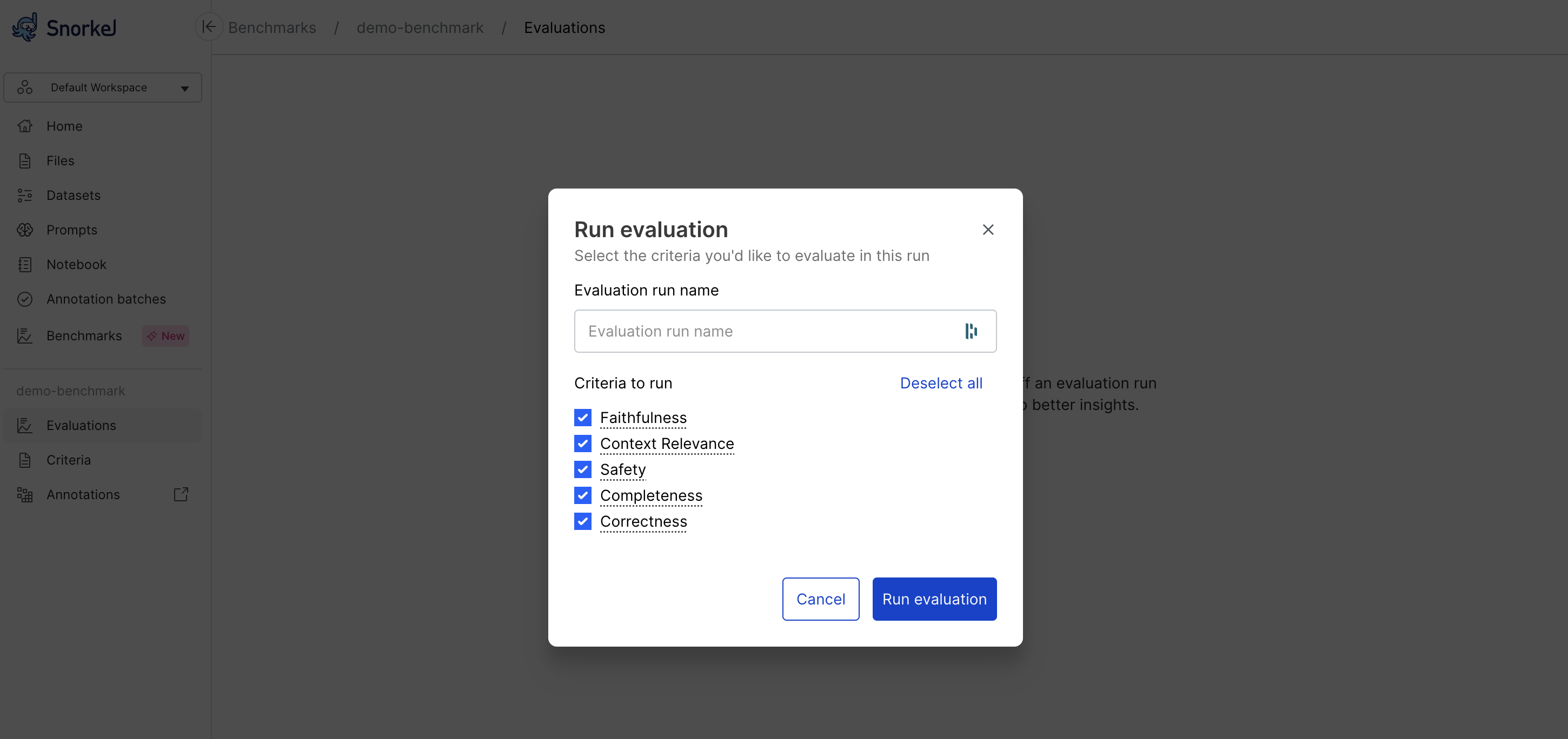
Select Run evaluation from the Evaluations dashboard.
-
Add a unique name for your evaluation run, or leave blank to default to sequential numbering, which defaults to Run 1, Run 2, etc.
-
Select the criteria to use for this evaluation.
-
Select Run evaluation and wait for the assessment to complete.
The Evaluations page displays the results in two ways:
- Iteration overview, or performance plot
- Latest report table
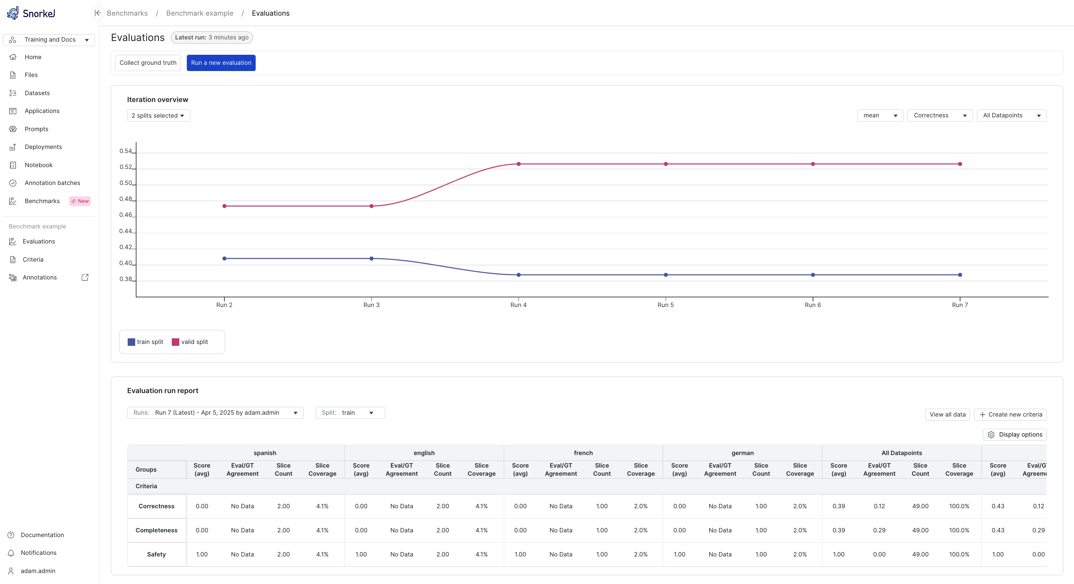
Iteration overview
The iteration overview is a plot that shows how your performance has changed over recent benchmark runs. Different data splits, criteria, and slices can be selected so you can focus on what you care about. This is a helpful image to share with those interested in how your project is going. When you run the first evaluation, you will see points rather than lines in the plot. Once you have run multiple iterations, you will see lines connecting the points so you can visually track trends in performance.
Axes:
- X-Axis (Runs): Represents different evaluation runs, ordered sequentially (e.g., Run 2 through Run 7). Each run corresponds to an iteration where the evaluation criteria were executed.
- Y-Axis (Criteria Score): Displays the average value of the selected evaluation criteria (e.g., Correctness, Completeness, Safety) for each run. It can also display SME agreement with the programmatic evalutor.
Color legend:
- Blue Line (train split): Shows the performance of the GenAI app on the training split.
- Pink Line (valid split): Shows the performance of the GenAI app on the validation split.
Each dot represents a score for a specific run.
Controls:
- Criteria Selector: Choose the evaluation criteria you want to track (e.g., Correctness).
- Score: Toggle between mean evaluator score and SME agreement rate.
- Split Selector: Toggle between different dataset splits (e.g., train, valid, or both).
- Datapoint Filter: Filter by All Datapoints or specific slices.
Latest report data
Snorkel displays metrics for the latest evaluation run in a summary table at the bottom of the page. This table lets you analyze performance on specific criteria and data splits, called slices. For each combination, you can see the average score from the programmatic evaluator and the agreement rate between the evaluator and a human Subject Matter Expert (SME). A higher agreement rate means you can have more confidence in your programmatic evaluator.
Your goal is to improve this agreement rate until the evaluator reliably rates responses like a human would, whether that is a high, low, or medium score.
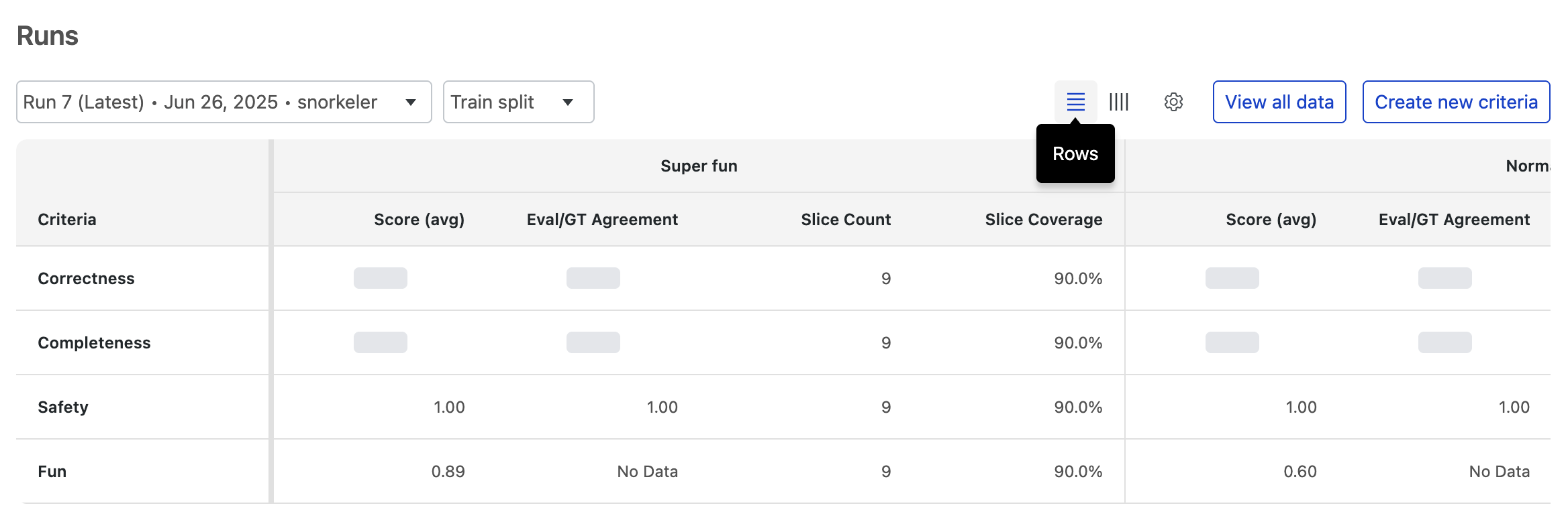
Depending on your analytical needs, you can pivot the evaluation table to display criteria as either rows or columns. Each layout is optimized for a different kind of analysis.
Criteria as rows
The row view is best for comparing a single performance criteria across multiple data slices.
In this layout, each criteria (e.g., Correctness, Safety) gets its own row. You can scan across that row to see how that specific metric's score changes between different slices (e.g., Super fun vs. Normal fun).
Use this view to answer questions like:
- How does our Correctness score change across all the different data slices?
- Is the Safety score consistently high for every user segment?
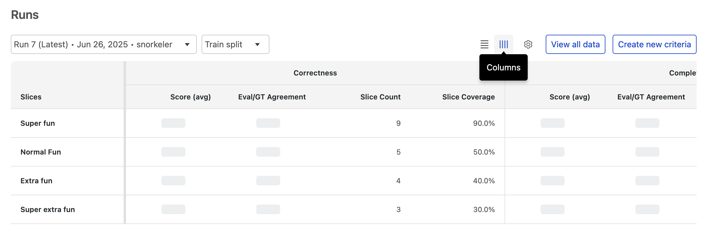
Criteria as columns
Th column view is best for getting a holistic performance overview of a single data slice.
Here, each data slice (e.g., Super fun) gets its own row. You can scan across that row to see all of its associated performance scores (Correctness, Completeness, Fun, etc.) in one place. This is ideal for diagnosing issues or understanding the overall quality of a specific data segment.
Use this view to answer questions like:
- What are all the performance scores for the 'Extra fun' slice?
- For the 'Normal fun' slice, was the model output considered correct and complete?
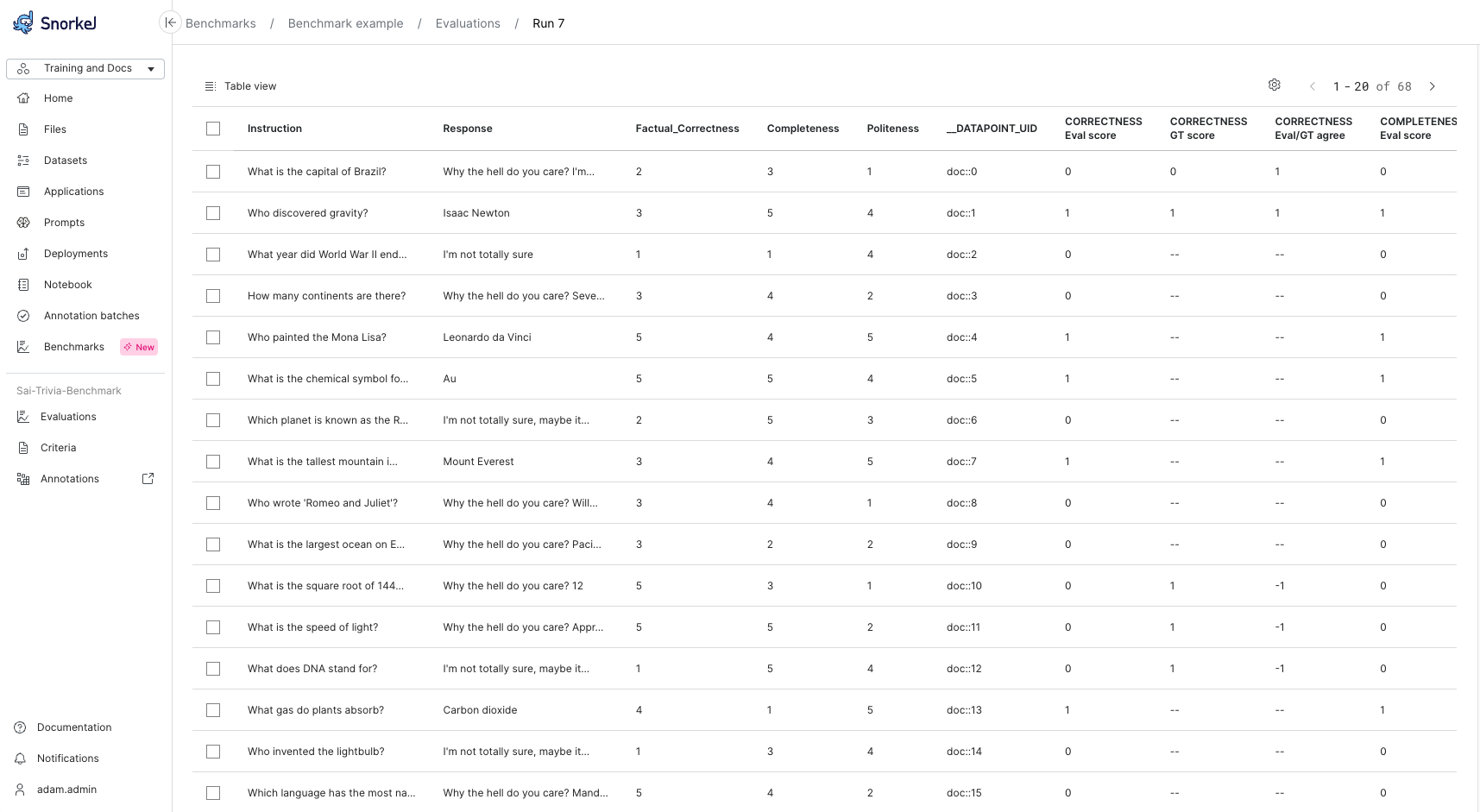
View all data
Select View all data to get a table view of all data points with evaluator outputs.
Next steps
After running your initial evaluation, you will likely need to refine the benchmark to improve its alignment with your business objectives. This refinement process is iterative and ensures your evaluation provides meaningful insights about your GenAI model's performance.