Overview page: View aggregate annotation metrics
This page walks through the summary metrics and settings that are found on the Datasets Overview page. This page is typically used by those with Developer and Reviewer roles that want a broad view of the annotations that have been completed as well as insight into the level of agreement among annotators.
Overview page
The Overview page shows you various aggregate metrics on the number of annotations that have been completed, the distribution of labels, annotator agreement, and a view into recent annotator activity.
You can select the Filter button on the top-left corner of the page to filter data by label schema, allowing you to view metrics specific to a particular schema. Additionally, you can use the Filter button on the top-right corner of the screen to filter charts by specific annotators.
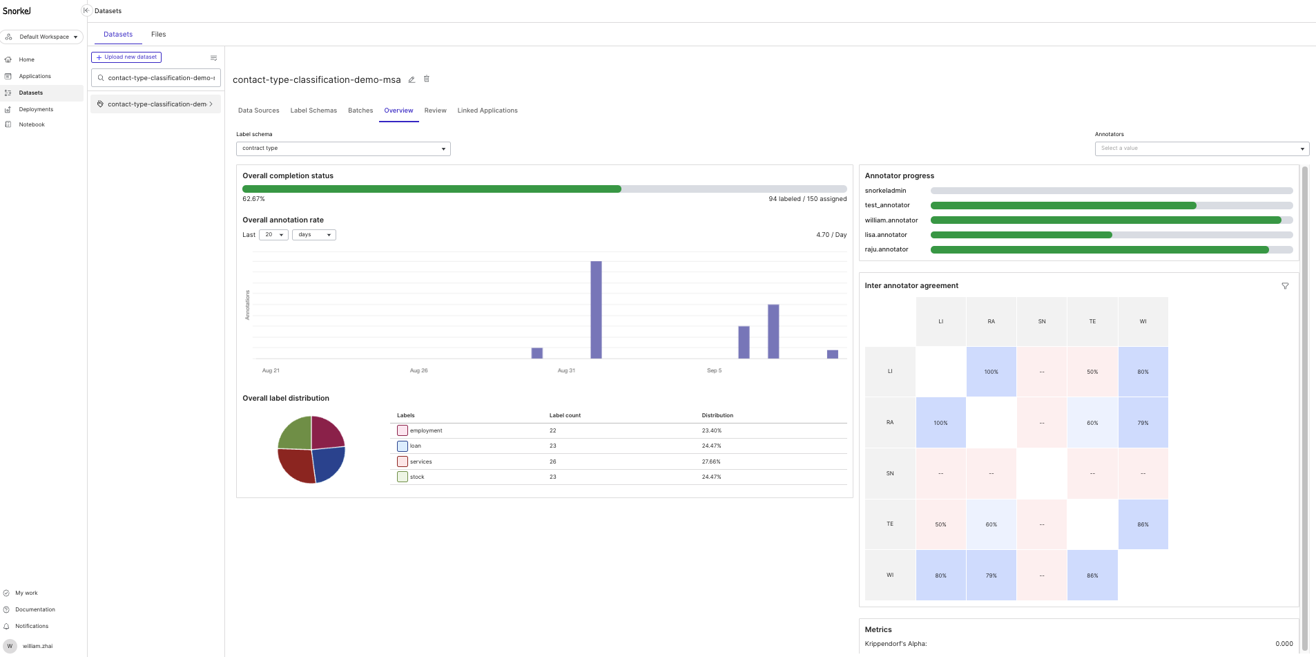
Overall completion status
The Overall completion status chart displays the percentage of assigned datapoints that have been annotated. The progress bar gives a good visual representation of how much annotation progress has been made.
Overall annotation rate
The Overall annotation rate bar chart displays the aggregate number of annotations that have been completed at different granularities that you can specify (e.g., last 20 days, last 4 months).
Calendar boundaries are used when referencing days (starting at 12:00am), weeks (starting Monday), and months (starting on the 1st day of the month). For example, viewing annotations from the last 2 weeks on a Wednesday will show all annotations that have been completed since two Mondays ago, not 14 days ago. Similarly, the last X months view will show all annotations that occurred within each corresponding month.
All annotations are displayed relative to your timezone, which is displayed in the chart. To change your timezone, select your user name in the bottom left corner of your screen. Click User settings, then click Advanced. Note that the SDK retrieves annotation timestamps in the UTC timezone, which is how timestamps are stored in the database.
Overall label distribution
The Overall label distribution chart displays the distribution of labels that have been annotated. This chart enables you to quickly see if there are particular classes that are underrepresented in the annotations that have been completed so far. Users with developer access can take this information and create new batches to get a more even distribution of labels. See Create batches for more information on how to create new batches.
Annotator progress
The Annotator progress chart displays the percentage of assigned datapoints that have been annotated, split up by each annotator. Hover over the progress bars for each annotator to see exactly how many datapoints that they have annotated compared to the number of datapoints that have been assigned to them.
Inter-annotator agreement
The Inter-annotator agreement chart displays the agreement rate between annotators where they have labeled the same data points. For example, if annotators A and B have annotated 10 of the same data points, and on 8 of those they have the same labels, then the shared grid will show 80% in the corresponding cell.
You can filter the chart by label class and or by batch. To do so, click the Filters button at the top right corner of the chart, then select your desired filters.
The Inter-annotator agreement chart will only show up to 10 annotators at a time to ensure a consistent, readable experience. To view the chart for all annotators, click the chart to render a modal of the full chart that is not truncated.
Below the chart you can find the value for Krippendorff's Alpha. This metric measures disagreement among annotators, corrected for disagreement that is expected from random chance. Ideally you want to see a value closer to 1, which indicates better agreement among annotators.