Analysis: Rinse and repeat
For a selected model in the Train pane, click Analysis to open the Analysis pane, where you can find analysis that helps you understand the performance of both your labeling functions and your models. It also offers suggestions on how to improve your end results.
In Snorkel Flow, this feedback can be directly acted upon by adding/modifying LFs or training a new model to target specific errors. Improving our model becomes an iterative, systematic process.
Clicking on Open Analysis will open the Analysis Modal. The Analysis Modal also allows you to compare multiple models and view the different analysis tools over different splits of the data.
If a split does not have predictions or ground truth labels, some of the analysis tools will not be available.
The predictions from a given model are recorded at the time the model is trained. To get predictions for any new data points added to a dataset, you will need to train a new model. On the other hand, the metrics on the Analyze page are computed live. As a result, the metrics may change in the following ways:
| Scenario | Metrics Updated for Existing Model |
|---|---|
| New datapoint(s) added | No |
| New GT addded | Yes |
| Existing GT changed | Yes |
Clarity matrix
The Clarity Matrix helps identify mistakes made by your model with respect to your label package. This allows you to identify a reasonable next step that would improve model performance.
Clicking on an element of the Clarity Matrix activates the relevant filters in Develop (Studio).
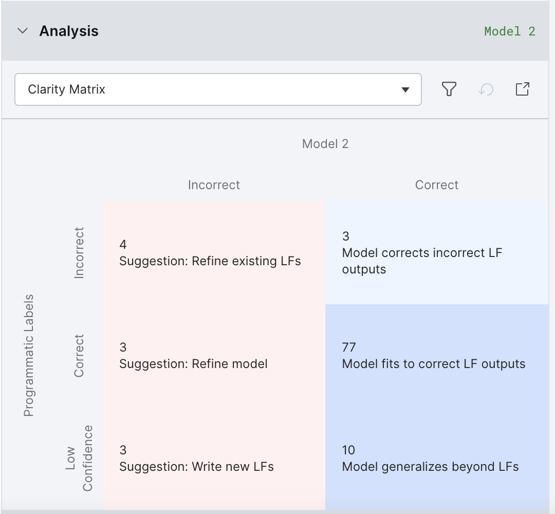
By default, “All labels” is selected and the Clarity Matrix displays information for all class labels. If you are interested in a specific class label, please choose it from the dropdown at the top of the Analysis Modal.
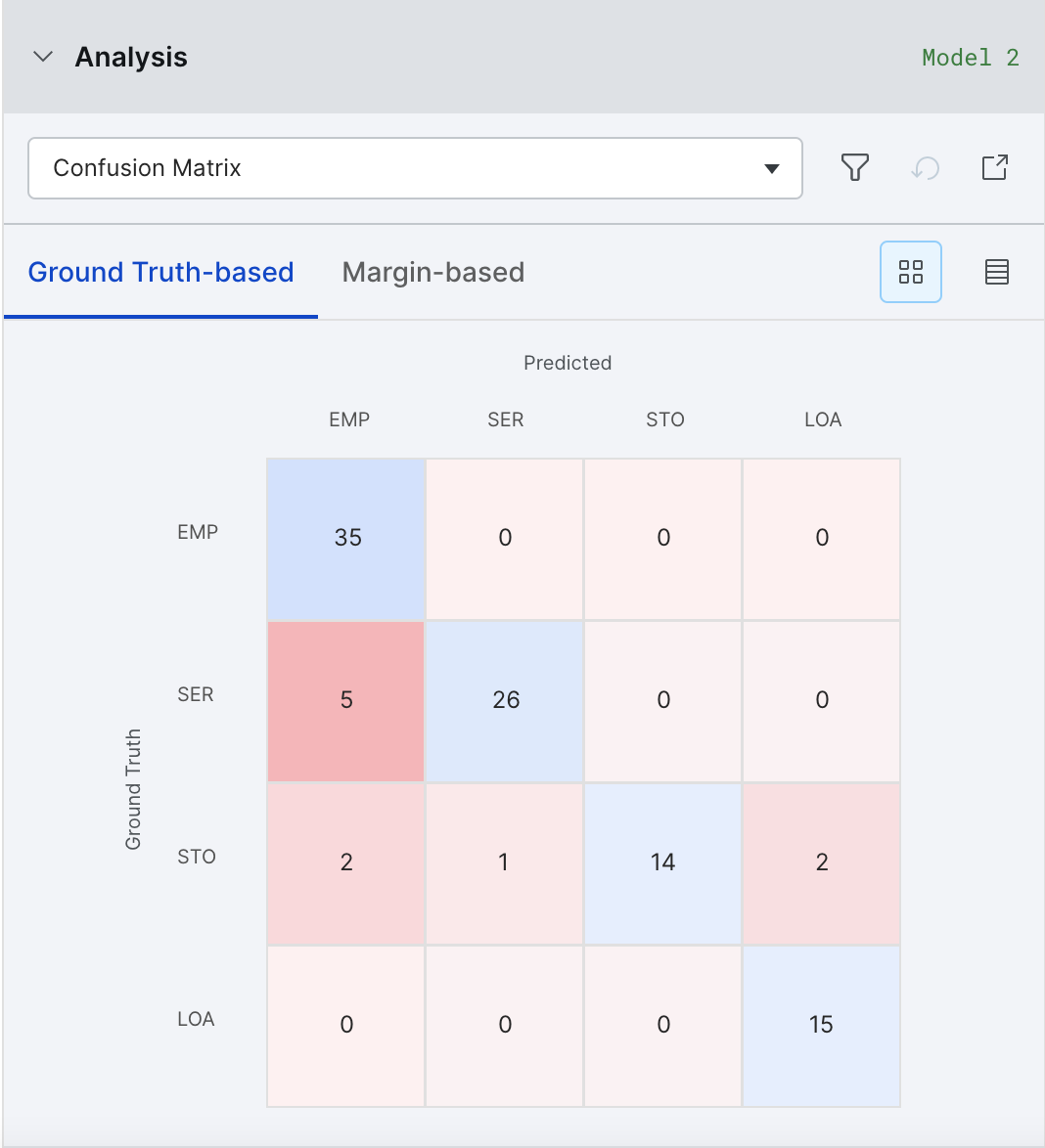
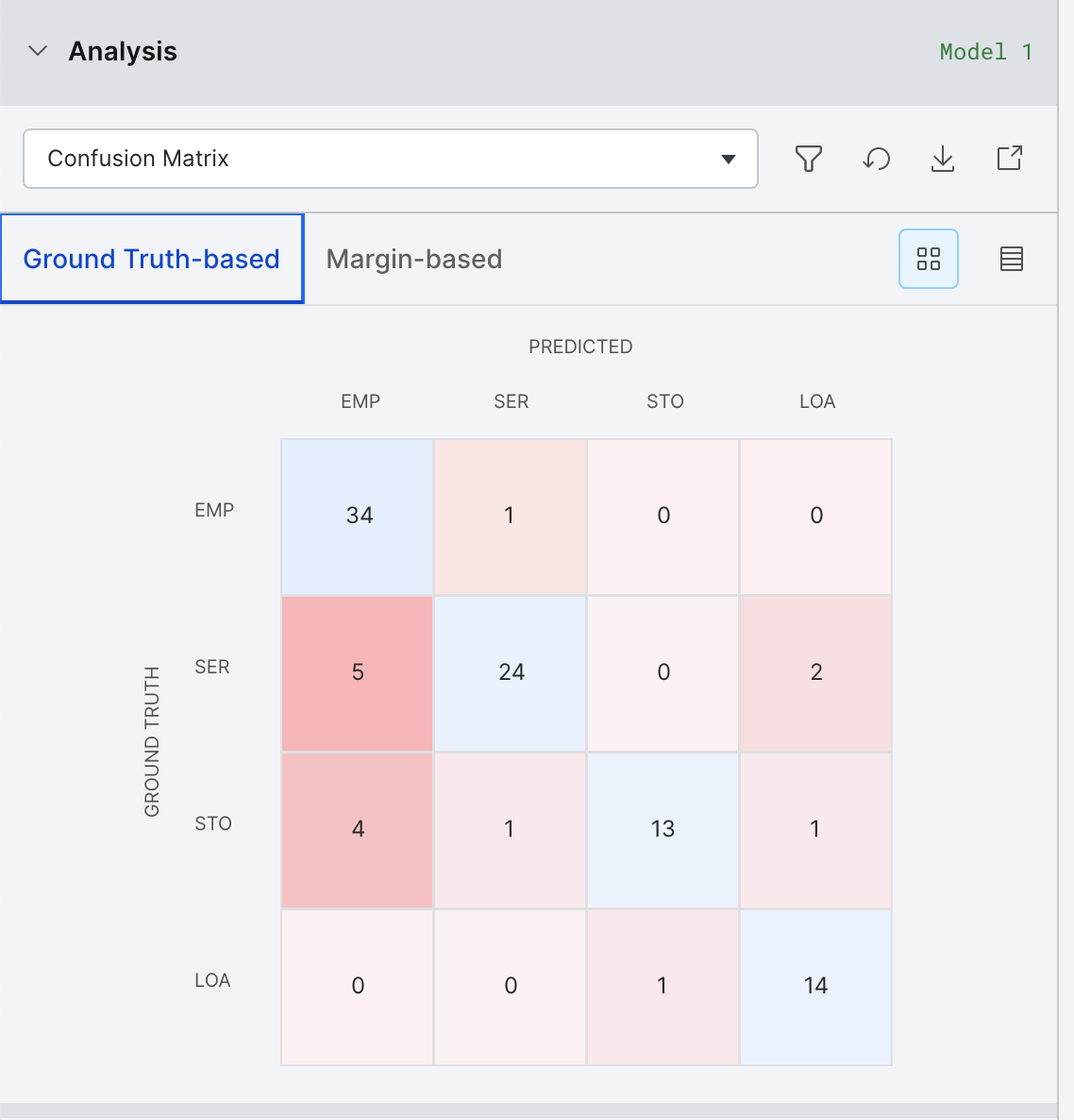
Confusion matrix
The Confusion Matrix helps to identify major buckets of errors being made by your model. There are two views available: Matrix View and Table View.
Matrix View is not available for high cardinality tasks.
Clicking on an error bucket will activate filters in Develop (Studio) to see all the samples in that error bucket.
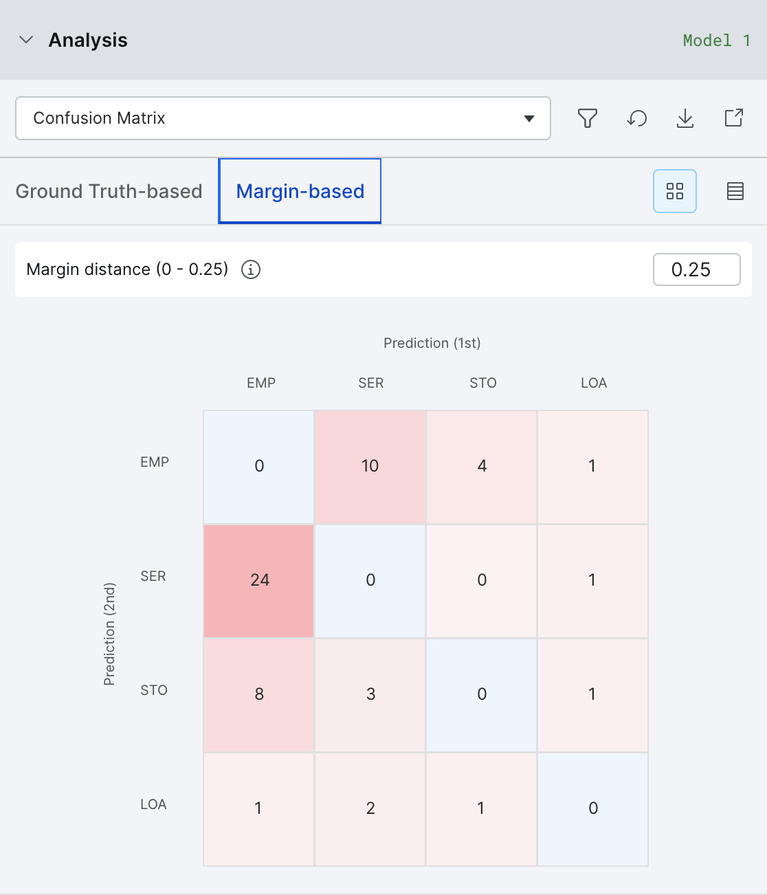
Margin confusion matrix
When you lack ground truth, the margin confusion matrix is a useful tool to identify likely errors in a similar way to the confusion matrix. Instead of using ground truth labels, the margin confusion matrix uses the predictions of the model and the measure of margin which is the difference between the. two most confident predictions. For example [0.5, 0.4, 0.1] has a margin of 0.5 - 0.4 = 0.1. The smaller the margin, the more confused the model is between the top two predictions. We can use this to find examples where the model is likely to be incorrect, or at least examples where the model would benefit from extra LF coverage.
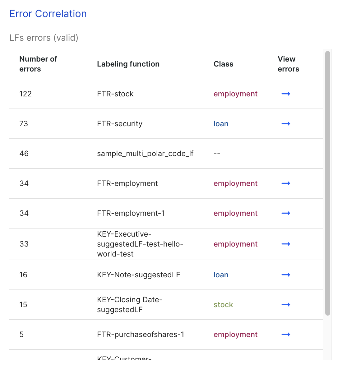
LF error contributions
The LF Error contributions lists all labeling functions whose incorrect predictions match the incorrect predictions from the end model.
Clicking on one of the LFs takes you to the Label page with a filter that shows examples where that LF is incorrect.
Label distributions
Label Distributions shows both the raw counts (on hover) and percentages of each class based on the labels from ground truth, predicted by the training set that the model uses (label model output), and predicted by the current model.

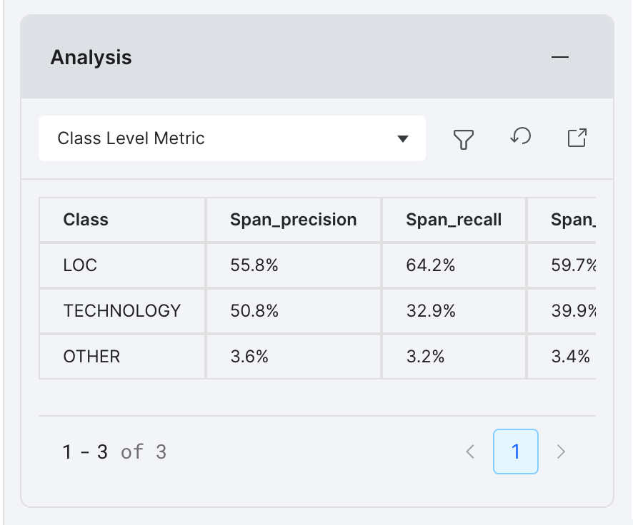
Class level metrics
Class level metrics displays model performance on per-class basis to help decide where to best focus efforts.
These class level metrics are available in Snorkel Flow:
From the Analysis panel, you can view all available class level metrics within the table. Scroll the table horizontally to view them all.
For a larger viewport and to compare metrics across models, select the launch icon to open the Analysis modal.
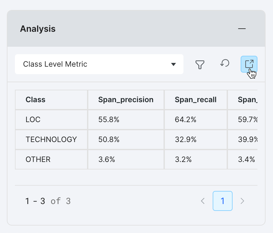
With the Analysis modal open, a table displays all of the class level metrics.
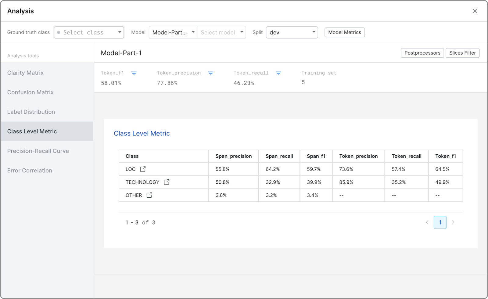
Select the icon next to a class name to view the Label page with the relevant filters activated.

To update the metric types you are interested in, select Open Analysis to open the Analysis modal, where you can select Model Metrics to access Metric Types.
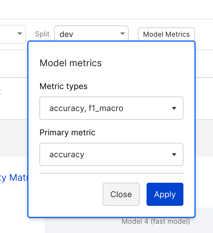
In addition to the built-in metric types, you can register custom metrics via notebook. See snorkelflow.client.metrics.register_custom_metric in the SDK reference for more details and examples.
Generalization
This provides two analyses:
- The improvement in data coverage by the end model compared to the label model created with your labeling functions. For example, if the labeling functions you created cover 80% of your training data, the improvement would be 20% because the end model can cover 100% of your training data.
- The generalization gap between your
trainandvalidsplits. If the difference in the accuracies for this is greater than 5%, then a warning about overfitting to the dev set is raised. Note that thetrainsplit score ignores the datapoints in thedevset, so in some cases this warning may not appear even if thedevandvalidscores have a difference more than 5%.
Some datasets can have large differences between the dev and valid set performances due to differences in underlying data distributions. If that’s the case, you might want to modify your data so that your dev and split come from the same distribution.
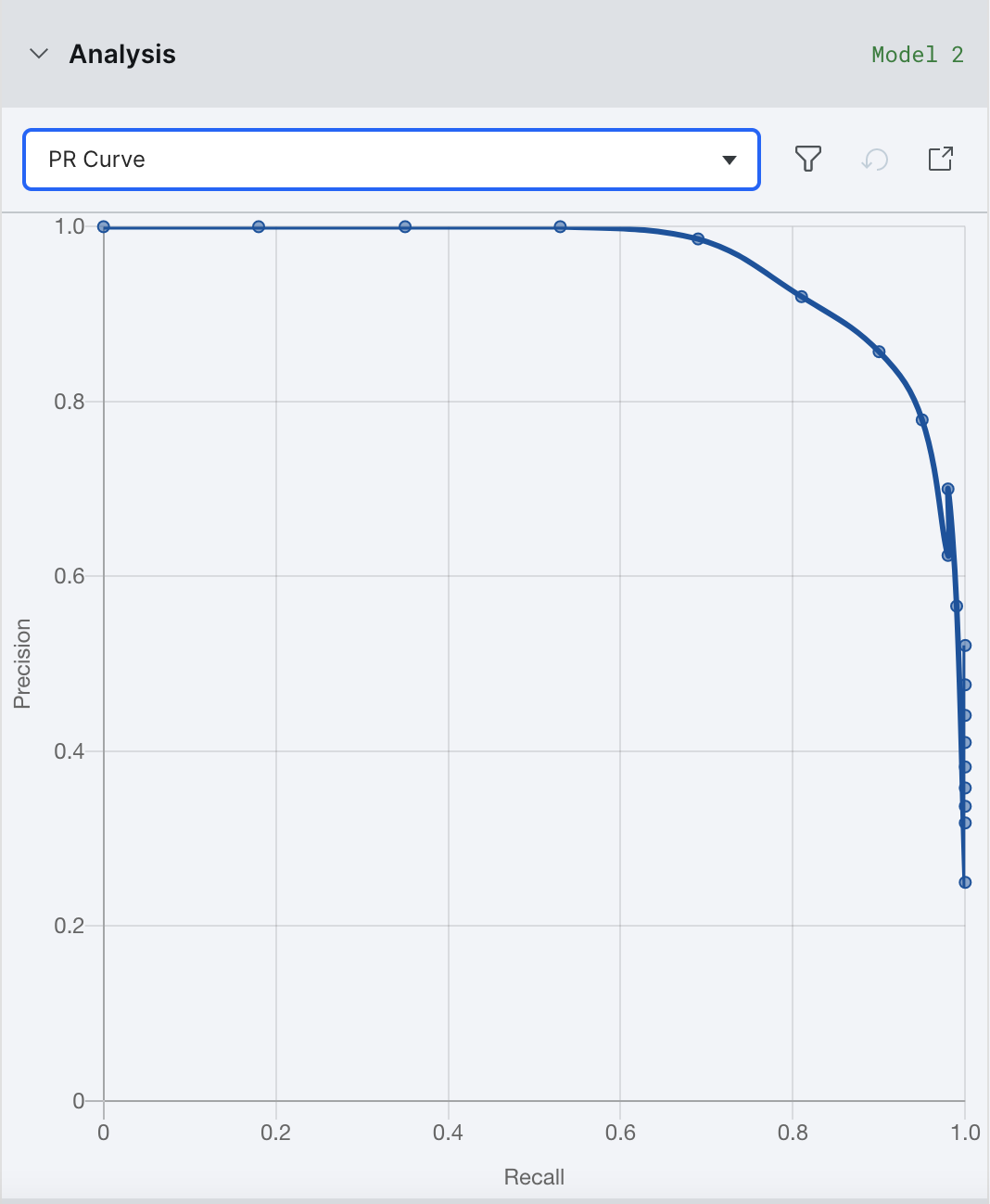
Precision-recall curve
The precision-recall curve plots the precision and the recall for different decision thresholds. This matters more for binary classification problems, and is especially useful for when your data suffers from class imbalance, e.g. there are more negative samples than positive samples.
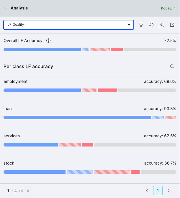
LF quality view
These visualizations display the behavior of your labeling functions over your ground truth data, and relates it to the downstream performance of the label model. You can use them to find which labeling functions should be refined. It groups each data point into one of five categories:
- Correct/Correct (solid blue): all LFs voting on these points were correct, and so was the downstream label model
- Conflicting/Correct (shaded blue): only some LFs voting were correct, but the label model was able to denoise the labeling functions and produce a correct training set label
- Conflicting/Incorrect (shaded red): only some LFs voting were correct, and the label model was unable to denoise the labeling functions which then produced an incorrect training set label
- Incorrect/Incorrect (solid red): all LFs voting on these points were incorrect, and so was the downstream label model
- Uncovered (grey): no LFs voted on these points, and so no training set label was produced
By clicking on any of the colored bars, you can view the data points in each group. We recommend starting with the shaded red group and working your way down to the grey group in order to improve your training data.
Filter metrics by slices
You can use the Slices Filter dropdown to view model metrics on subsets of the data. Here, you will see all of your error analysis slices as defined in Error Analysis Slices. You can then check or uncheck individual slices to include or exclude those examples from the analysis.
Error analysis by slices
You can use methods of error analysis like the slices-based analysis chart and tables to survey your data in the iterative development loop.
Slice-based analysis: Chart view
The slice-based analysis chart shows the correct (blue) and incorrect (red) data count for each slice. To also see the count for data without GT, toggle the Show GT is Unknown button.
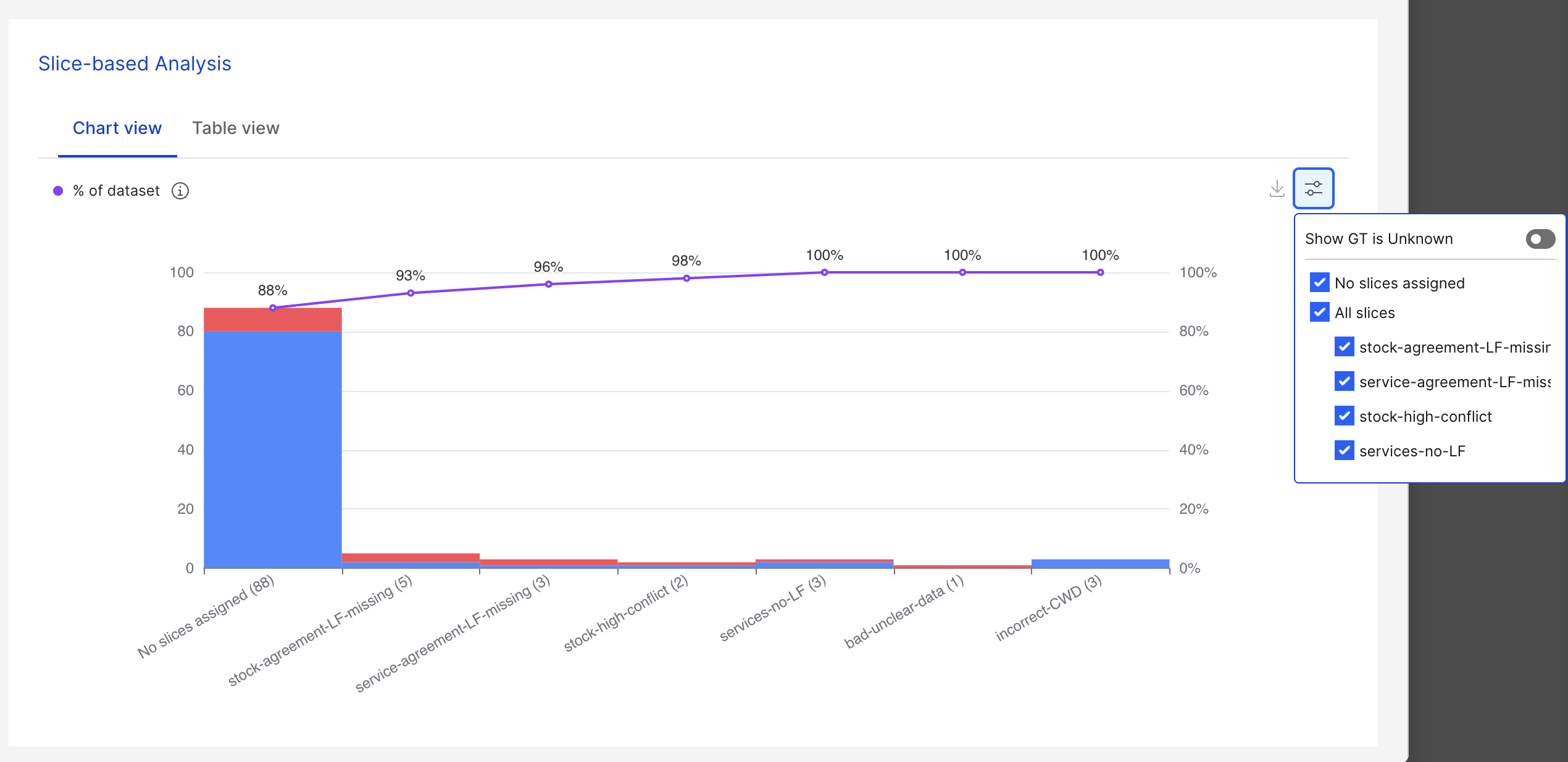
Incorrect data signifies data where the ground truth is not equal to the prediction. You can go through incorrect data and categorize them into smaller error buckets by adding slices to the data based on the error types.
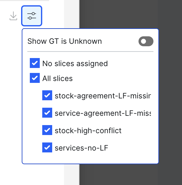
Filters can also be used to display only the slices you’re interested in viewing. You can display all slices by checking that option, or you can display any number of them by deselecting the irrelevant ones in the filters.
The purple line above the bars represents the size of each error bucket accumulated from left to right. The values denoted by the purple line correspond to the percentages on the right y-axis.
If the user iterates through each error bucket from left to right and fixes all the errors in each of the error buckets, the % of correct data over the entire dataset will be the same as the number denoted on the purple line.
Slice-based analysis: Table view
The table view shows each of the slices and their respective maximum F1 macro growths of the entire selected dataset. The maximum F1 macro growth for each slice indicates the maximum increase of the F1 macro score (model performance) that we can achieve if all the errors in the slice get fixed.
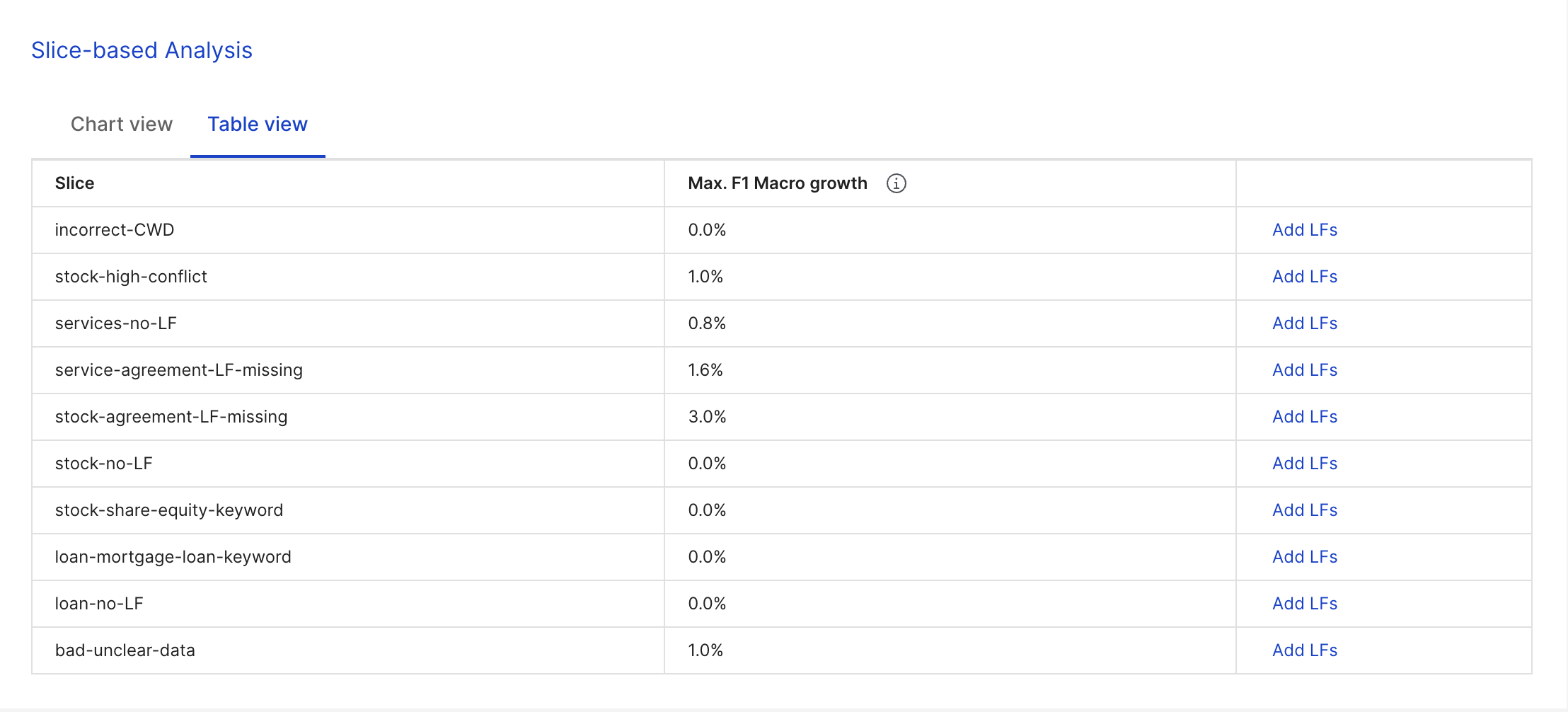
One-click to add LFs from slices The Add LFs button (right column) allows you to add up to five suggested label functions (LFs) to their corresponding slices. Suggested LFs are based on the slices data and can be added using one click. A success notification appears if high quality LFs are added successfully.
A successful LF is one that has precision > 85%, and unsuccessful LFs cannot be added.
Postprocessors
Apply postprocessors when turned on will reflect in the metrics, i.e., all post processors for the model node will be applied before calculating the metrics. This is turned on by default.
Suggestions
In the right pane, you will find suggestions. Details on each message you may see:
- Try tuning on valid set: The Label Model’s distribution has a class with distribution > 10% points different than the Ground Truth’s or Model’s output.
- The following LFs are correlated with model errors…: These LFs are causing a disproportionate amount of errors.
- Try tuning or oversampling based on the valid set: The train score is 5 points higher than the valid score.
- Resample dev set iterate on LFs: The valid score is 5 points higher than the train score.
- Try improving precision of LFs in Label: More than half the errors are from the LFs outputting incorrect predictions.
- Try training a model using LFs as features: More than half the errors are caused by the model incorrectly predicting a correct LF output.
- Try writing more LFs: The model predicts
ABSTAINon more than half of errors.